Table of Contents
StepByStep Plugin
Installation
Install the plugin using the Extension Manager and the download URL above, which points to latest version of the plugin. Refer to Plugins on how to install plugins manually.
Requirement

Examples/Usage
The purpose of the plugin is to display information (as a box) that can be expanded by clicking on it to show more details.
A simple box with title is created this way:
#: Title of the hidden content
Hidden content goes here
:#
The Image shows the following:
#: Step 1
If you already know this, you can also continue with [[#step 3]].

more text...
:#

#: Step 2
Much more Text...
:#

#: Step 3
Finally done :-)
:#
Syntax
There are two start(#:, ##:) and two end (:#, :##) tags.
A complete box is created according to the following scheme:
- Start:
#:title[||options]/n - Content:
content - End:
:#/n
The title is optional, but it makes no sense without a title. Here the DokuWiki markup is not parsed. Each title becomes the anchor of a box, following the naming conventions of DokuWiki. Characters that are not allowed are replaced by _. This also applies to :. This makes it possible (e.g. in instructions) to skip steps by specifying the corresponding target step in a link(e.g:[[#step_3|step 3]] link to a box with title Step 3 on the same page).

The content is optional as well. But it also makes no sense to work without content. The content understands DokuWiki markup.
Options are possible in the start tag. These are separated from the title by a double pipe (||). Each individual option must be separated from the next by a space.
Currently the following options are supported:
| Value | Description | Example |
|---|---|---|
| open | expand the box by default | #: Step 1||open |
preview:xxx | expand part of the box to the specified height, where xxx is a css length | #: Step 1||preview:5em |
| noframe | removes the border and background, set title to bold | #: Step 1||noframe |
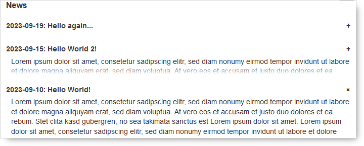
Options and combinations with noframe:
#: 2023-09-19: Hello again...||noframe
Lorem ipsum dolor ...
:#

#: 2023-09-15: Hello World 2!||noframe preview:2.5em
Lorem ipsum dolor ...
:#

#: 2023-09-10: Hello World!||noframe open
Lorem ipsum dolor ...
:#
Nesting of levels is possible.
Configuration and Settings
There are no additional settings.
The following colors are used and depend on the style chosen:
| Element | Color in style | style.ini |
|---|---|---|
| Box header background | Neutral background color | @ini_background_neu |
| Box header hoovered/opened | The general link color | @ini_link |
| Box background | Main background color | @ini_background |
| Box Border | The general link color | @ini_link |
| Text | Main text color | @ini_text |
Those colors are easily changed. The bundled styling plugin available via “admin” → “template style setting” allows easy changes. Alternatively, one can directly edit style.ini file.
Change Log
- version update (2023-09-25 10:19)
- new option: noframe (2023-09-25 10:18)
- version update (2023-08-25 09:17)
- New option: preview (2023-08-25 09:16)
- Rename Class names for compatibility (2023-08-06 14:31)
- New: options possible (2023-07-27 13:24)
- Initial commit (2023-07-19 15:35)


