This is an old revision of the document!
Table of Contents
DokuWiki Logo Redesign
About DokuWiki
DokuWiki is an Open Source, web-based software for collaborative knowledge management. It's distributed for free and used by thousands of users worldwide. The main activity consists of creating and editing documents (pages) and linking them, thus creating structure. Use cases include personal notebooks, corporate knowledge bases, software manuals, project workspaces and intranet info systems.
You can learn more about DokuWiki and it's features at www.dokuwiki.org
The DokuWiki Logo
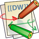
The current Logo (pictured on the right) was created several years ago by Esther Brunner.
It depicts multiple sheets of paper representing the different pages inside a wiki. Two different colored pens symbolize the multiple users editing pages. Arrows in corresponding colors represent the linking feature of a wiki.
The pen colors were chosen based on the colors which represent existing (green) and non-existing (red) pages.
The letters “DW” stand for “DokuWiki” and are surrounded by double square brackets - the syntax used to create links in DokuWiki's editor.
Over the years the current logo has become a recognizable brand among Wiki users.
Uses
Here you can see some examples of how the logo is used in different contexts.
Identified Problems
In 2012 a new, more modern design for the DokuWiki application was created (can be seen at www.dokuwiki.org). The old logo remained and now looks a bit out of place.
In addition, the details of the logo are problematic when scaled down or transferred to different color spaces. Eg. the logo can not be easily downscaled to typical favicon sizes (16×16 pixel) without being nearly unrecognizable.
Redesigning the Logo
The goal is to have a “refresh” of the logo with a more “modern” and “simpler” appearance which can be easily used in different contexts.
Longtime DokuWiki users should still be able to recognize the logo as the new DokuWiki logo.
Restraints
The following restraints should be adhered in the redesign:
- The logo should approximately fill a quadratic space
- The logo should not contain the word “DokuWiki”
- The logo should not be made up primarily of typeface
Required Formats
After having a workable design idea, the final design has to be delivered in at least the following formats:
- The original file format the logo was created in (may be proprietary)
- Full Color logo as scalable SVG for arbitrary larger sizes
- Simplified color version as pixel perfect 16×16 pixel PNG for favicon use
- Simplified grayscale version as pixel perfect 16×16 pixel PNG for interwiki link icon use
- Monochrome lineart version as scalable SVG for use on T-Shirts
- Optionally other pixel perfect sizes as PNG for small sizes (24×24, 32×32) when a downscaled SVG does not suffice
Licensing
The logo in all versions has to be licensed under the GPL Version 2.
The designer of the chosen logo will be mentioned on the dokuwiki.org website and the source code of the application itself. The designer is welcome to use the work in his portfolio.
Resources
Available Material
Current logo graphics can be found at https://www.dokuwiki.org/logo in various formats. These can be freely used in the new design if needed.
Discussions
The DokuWiki developers are happy to give feedback and opinions on proposed ideas. Either at the mailinglist or in the Bugtracker, the latter will also contain any submitted designs and links to public discussions so far.
Discussion can also be relayed through the contact given below.
Inspira tion
Well done logo redesigns, where the logo was simplified but still is recognizable include Chrome, Skype and Microsoft (seen on the right).
Our new template design makes use of the free Dusseldorf icon set which might serve as stylistic example for a monochrome version.
Keywords often associated with DokuWiki are: collaboration, easy, simple, editing, flexibility.
Participation
Contact
To participate or to ask questions, simply send a mail to Andreas Gohr. If anything is missing on this page, just send a mail as well.
Please note that, due to the democratic nature of an Open Source project your design drafts will be made available to and be discussed in public.
How to participate
To participate simply get started and send your first suggestion to the contact given above.
Deadline
Unlike in commercial projects, there is no deadline here. This is an open task until we found a new design we like. As long as this page is up, the task is open.
Please be aware that all work done on DokuWiki is done by volunteers, so responses might not be as quick as you might be used to with commercial customers.


